Considerations for a media player that is designed for learning and teaching purposes would be something of a dream project. Unfortunately my brief was not to imagineer an ideal media player for students and academics but to troubleshoot the design of an existing media player.
To put my story into context, a player had been designed and developed for use on the university’s virtual learning environment (VLE). There was a number of reasons why we could not use an ‘off-the-shelf’ player, the principle suite of reasons orbited the topic of accessibility
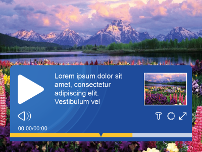
The new design did address these factors and looked very smart but the designer had not anticipated the rush to deploy multiple players on screens – they had expected – based on previous usage – that only a single player would exist per screen. Despite this previous trend, conversations around the new player had led educational content designers to use more than one.
Unfortunately the height of the player was in the region of 110 pixels, and when combined with the height of a thumbnail was starting to dominate the screen. A floating player – where the transport mechanism only reveals itself on rollover was not available due to the method of hosting the video and the use of iframes in the user interface. The player was owned by multiple stakeholders across the university. Any new design had to be signed-off by the entire community.
My brief was to re-design the player with a reduced height. Therefore I began my thinking process from the inside of the player – and worked my way to the outside. The player need to house specific controls – and also contained a few which I thought it was time to challenge.
- Do players require both pause and play controls at the same time?
- does fast forward and rewind mean anything anymore?
- Audio mute function – is there a consensus on signalling this?
The player existed in two forms, one for our VLE which students would need to use, and the other version was for general use. Each version required a common set of controls and some controls specific to the deployment.
I had recently been involved in creating a suite of icons for the VLE and was able to exploit this for the media player. The icons had been designed at a minimum size of 16 pixels. The player would require a timeline of some description running the full available width of the player. I could make this small – I opted for 4 pixels, and set my margins to 2 pixels, thus my total height could be 22 pixels. 88 pixels smaller than the previous version.
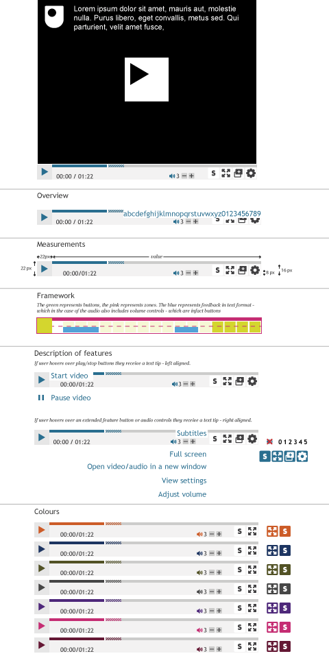
The functions where accessed via buttons each with an icon and tool tip with Aria, for the students they were: full screen, settings, view transcript, captions etc. Each icon was floated right and they built to the left – the design was independent of the content for deployment – making it customisable. This led to the addition of colour choices making it possible for content designers and stylists to coordinate their presentation.
I met with stakeholders on an individual basis to get feedback, and rolled their criticisms into the next design iteration where possible. Once I had all the stakeholders onboard with the new design I arranged for a larger formal meeting to approve the design ready for final deployment. The player was open sourced via GitHub.
In an ideal world, we would now return to the media player with a view to considering what would constitute a world class media player for learners and teachers. I have lots of ideas and I hope that one day I get the chance to help elevate the design further.