I had to create an identity for an academic project.
I was told to “Keep it simple and don’t spend too much time on it if at all possible. Just a clear logo for “ReMaLIC” that can be distributed to partners as a graphic that they can drop into materials (in Arabic, French, Nepali, Bengali, English…)”.
I enquired about the group of countries, I was curious to know what groups them together. Apparently they were all “countries from DAC list (Development Assistance Committee List, i.e. lower income countries); and “these research projects should provide evidence toward the achievement of Goal 5, on gender equality, which sets out a desire to achieve gender equality and empower all women and girls.”
![]()
Further clarification was also provided. “It seems that issues of educational marginalisation are largely universal (consequences of poverty, ethnic and gender discrimination, language barriers, lack of good teachers in remote areas…) but we (my client) are particularly interested in challenges faced by young people aged 13-15 (a transitional phase when many drop out of education and enter employment) and we aim to discover local or culture-specific issues that may be less well known.”
![]()
Trying not to spend too much time, I used wikipedia to learn a little about the national identity of the primary participating partners: Bangladesh, Nepal, Senegal and Sudan. I noted the national flags and that the colour red was a consistent colour on all 4 flags. I gambled that red would be a viable colour option for an initial set of designs. As a rule, I tend to design for shape rather than colour so as long as contrast is strong enough to satisfy WCAG 2.1 I should be ok.
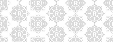
My initial suite of ideas didn’t tessellate, and were rejected by my client as not suitable. I attempted a second round of design work and gained very positive feedback. These results are presented here.