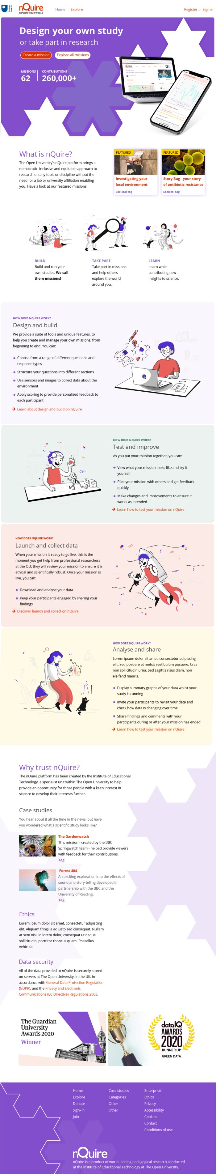
Overview
When nQuire was originally designed with the help of the agency Clearleft, we had some fantastic ideas about communicating it to its intended audience, but for many reasons the site homepage was scaled back to such an extent it became unclear what nQuire was for. As a result, the resources we made available to members of the public who wish to learn about being a scientist for free were not used as widely as we would have hoped.
We want members of the public to think of nQuire as a place to participate in, contribute to and initiate scientific processes. Yet the academic team behind the platform were needing to do a lot of ‘leg-work’ just to explain and promote the site to experts, with public involvement being less than we hoped.
This work was conducted via online video conferencing using Microsoft Teams with collaborative design work orchestrated using Miro boards. Video calls are not ideal for discussing detail within a design process and things took longer than I would have hoped. However, the post-pandemic world provided us with an opportunity too. New societal challenges could be investigated on the platform – but we needed to raise awareness of the potential. We also needed to provide a better overall site narrative to explain its value to members of the public.
The work is not yet complete, but this post is an update on what we are currently working on with nQuire.
Audience and narrative
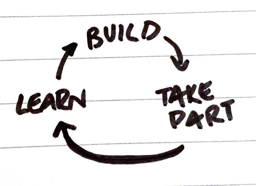
Nquire uses the term ‘mission’ to describe a study. The reason behind the terminology is long and slightly irrelevant, but it did seem to confuse our audience, so we decided to explore using the term ‘study’ on the homepage, and then explain our usage of the term ‘mission’ later in the text. Some user-research revealed that the homepage would not be a major destination for anyone seeking to contribute data but would be for those seeking to collect data. Within a learning and teaching context the process felt cyclical – not linear and after some conversation within a team meeting, we agreed the sequence was to build first, then take part followed by learn which then led to further building of missions. So, we prioritised the act of designing a study and creating missions as our primary story. We reasoned that once a new mission was created, we should provide the tools to help the mission-author promote their study. The big numbers on display are to reinforce the notion that nQuire is a credible platform for running studies and collecting data.
Design process
The page narrative was developed over time using a design thinking process. A report was commissioned to help us understand the problem we were trying to solve. A definition was formed, and we began to ideate on what we could do in response. A text document stripped of any visual cues – except some editorial emphasis – was developed. This ‘screen-reader’ friendly script enabled us to sense-check our story prior to adding visual details. Prototyping started as a visual sketching exercise but quickly developed in artwork created in Adobe Illustrator. At a certain point the prototypes transformed into static HTML and CSS web pages to get a better feel for the direction we were heading. A final snagging phase led to a lot of revisioning of our work consistent with general agile project management approaches and we iterated on every detail.
Look and feel
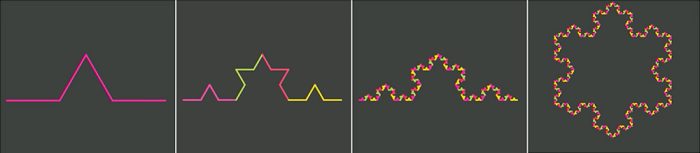
The colour scheme for nQuire was chosen on the onset of the original design and seemed more than adequate for the site. The site logo was simplified but is broadly the same as before. The typography for the home page was simplified too and will cascade throughout the site as further enhancements are completed but is not a radical change. The Koch snowflake has been deployed as both a decorative element and to connote the way the iterative addition of more points to the snowflake are analogous to the increase in data-points revealing more to a mission author and thus making for a more valuable study. As a product of mathematical thinking, the association of the Koch snowflake with nQuire also denotes the beautiful potential of STEM topics to members of the public that wish to develop their science skills.

An illustrative style of image as seen in the homepage design was preferred to photographs. Illustrations enable us to describe an imaginative use of nQuire far better than photographic images which tend to be perceived as a literal representation of a user case and often feel like a banner advert too. The site will – of course – make use of photographic images in to communicate effectively elsewhere.
Development
The project is now heading toward its formal development into a bootstrap environment and will no doubt morph into its final shape as the constraints of various display formats necessitate change and feedback is gathered from real-world examples of assisted technologies engaging with the site.